Two new releases, “Viaggio notturno” and “È successo un guaio,” are a perfect occasion to share ideas about graphic novels, the noir genre, and the NOIR 2024 poster designed by Vanna Vinci

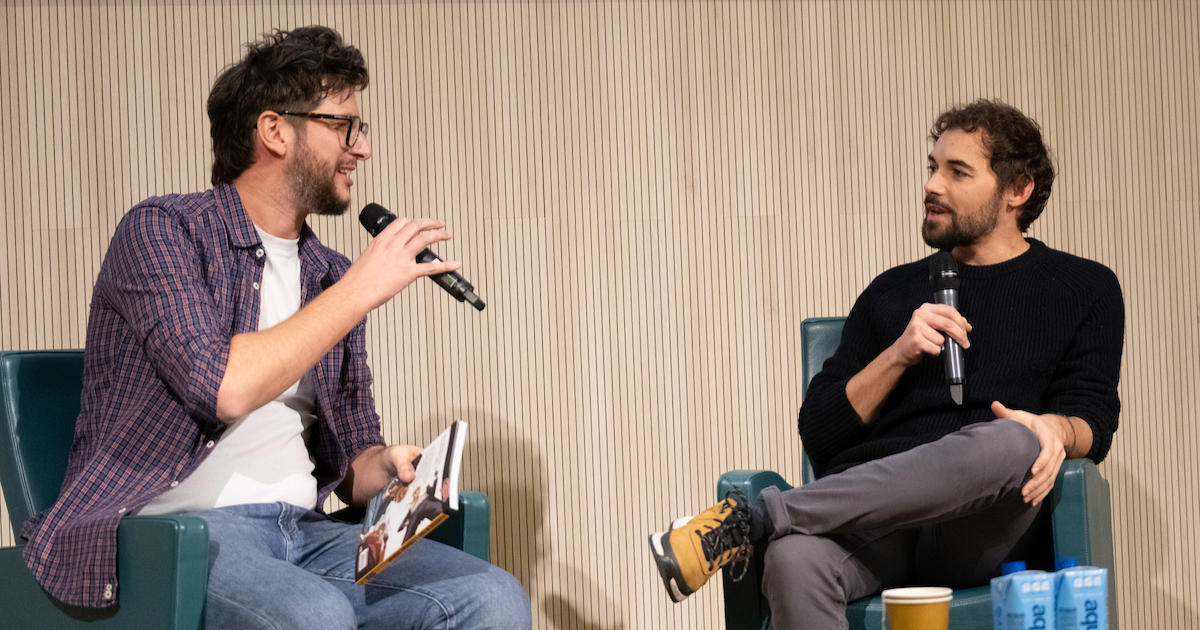
Lorenzo Palloni is a well-established cartoonist, despite the fact that he is not even forty. And his career is linked to noir, although he has works of science fiction, horror, and comedy under his belt as well. Here at the festival, he’s in Milan to present his series set in La Spezia (a city where he spent seven years), È successo un guaio. But his thoughts on comics and graphic novels went well beyond a single book presentation; he took the opportunity to ponder the craft itself and his own ties to the genre.
“Noir comics actually break the mold, to a certain extent,” opined Palloni, “since, to readers of comics, the noir genre is associated with the 1970s and the so-called ‘Italian noir’ – Diabolik, Satanik, Cattivik – the ‘K factor’, you could say. In reality, noir is a device for looking hard at our society: it has no sell-by date. Noir, that is, is a contemporary label for a kind of literature with certain dynamics.
“I’ve always been an avid reader, of noir, above all,” Palloni went on to explain. “At one point, it seemed natural to combine my interests. At the age of six, I started reading Ian Fleming’s 007 novels, since children’s books bored me. Incredibly, at that tender age I was reading about tits and ass and explosions! And the endings of those novels were terrifying: Bond lost every time and the finale was always a cliffhanger. The result was, I never went back to reading children’s books, one of the reasons I don’t write that kind of book today. All in all, it came naturally to me to bring those noir codes to my comic books.”

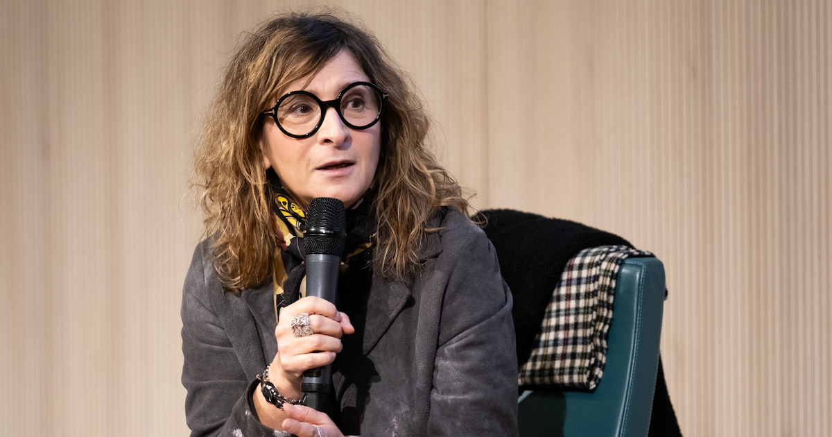
Vanna Vinci was at Milan’s IULM University not just to present her graphic novel Viaggio notturno, now in its third installment (I sotterranei), ahead of a fourth one slated to come out next year.
In fact, the woman cartoonist from Cagliari also designed the poster for this year’s Noir in Festival. “When I was asked to do the poster,” Vinci told the audience, “I instantly thought of the character in Double Indemnity) by Billy Wilder, Phyllis Dietrichson. She was played by a superb Barbara Stanwyck. The film is one of my favorites and she is the super evil one, the femme fatale to end all femmes fatales. I remembered a visually shocking sequence in which she and Walter Neff (Ed. Note. Fred MacMurray) decide to kill her husband. She decides, that is, and he goes along. This scene takes place in a supermarket. It’s the 1940s, and she has these black sunglasses, blond hair, and she’s wearing red lipstick.
“It’s a total poker face. Not a shred of emotion is showing. We can’t see her eyes; she is the iciest of blondes. So I drew Barbara Stanwyck in this situation, almost frozen in place, and I added a glove and a cigarette to increase the feeling of distance. Then I went for a background that was indeed from the film itself, but I reworked it so that it might appear to be a scene set anywhere at all. The image is very 1940s and therefore extremely dated. At the same time, maybe due to the clothes and the shoulder pads, it reminded me of the ‘80s. So now I wanted to use primary colors: yellow, the magenta of the lipstick, the ciano for the background, the red dot of the cigarette. All colors that are more about the ‘80s, which, in creative terms, was a very exciting time to be in Milan, a legendary era.”


